Behold a kitchen and dining area brought to life by design superstar Sarah Robertson of Studio Dearborn featuring Walker Zanger stone tiles and slabs. This project, designed for Sarah’s incredible photographer and friend, Adam Macchia and his family, blends Italian charm with New York turn-of-the-century style. We sat down with Sarah to uncover the inspiration behind the design, the key features of the space, and just how she created a space that is functional and visually striking. Continue reading and feast your eyes on this showstopping kitchen with photography courtesy of Adam himself.
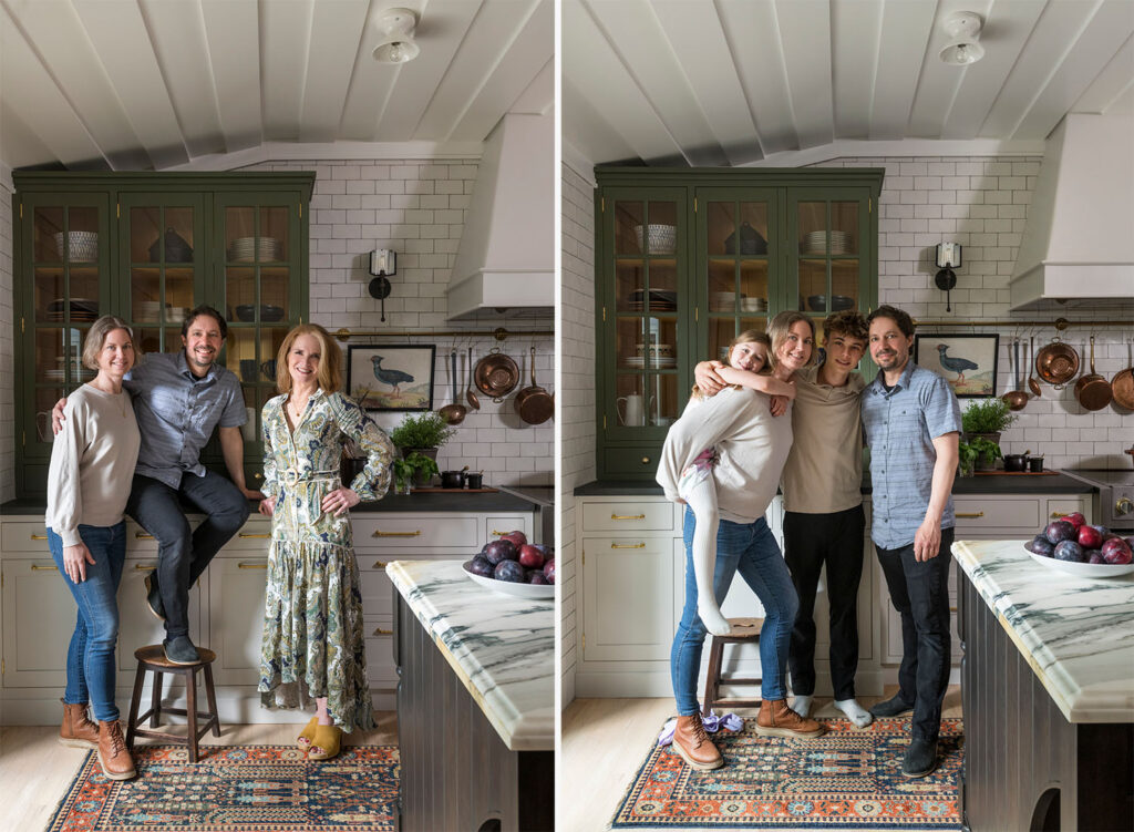
Q: What was the overall inspiration behind the design of this project? Were there any must-haves for the space from the family?
Sarah: Adam wanted a kitchen with a bistro feel, blending Italian charm with New York turn-of-the-century style. We aimed to create a space that feels both nostalgic and contemporary, reflecting his unique taste.
Functionality was key, along with making the kitchen feel very ‘original’ to their Cape Cod home. We focused on integrating elements that matched their lifestyle while enhancing the character of the space.
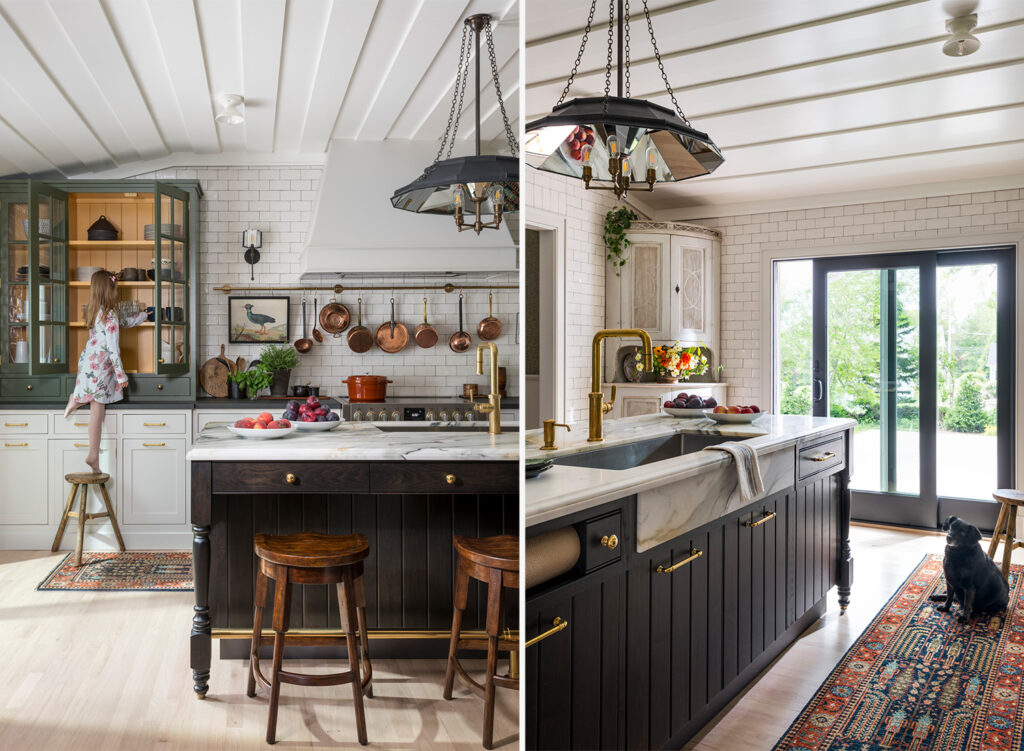
Q: Can you explain the design and technical choice to feature the marble slab from Walker Zanger on the kitchen island? What about Laminam’s I Naturali Collection on the perimeter countertop?
Sarah: We sought a blend of old-world elegance with the Paonazzo marble and classic, low-maintenance options like Laminam. The Paonazzo’s bold veining brought vibrance to the kitchen, turning the island into a standout feature.
Nero Greco, also available at Walker Zanger, serves as the perfect background player, providing contrast without drawing too much attention. It complements the Paonazzo marble while being subtle and practical.
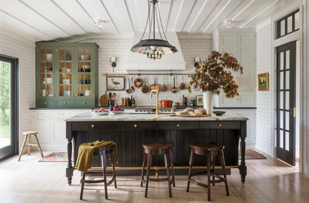
Q: How do you think the different countertop surfaces work together in the space?
Sarah: They work together seamlessly. Although they are different, they complement each other very well, enhancing the overall design without overwhelming it.
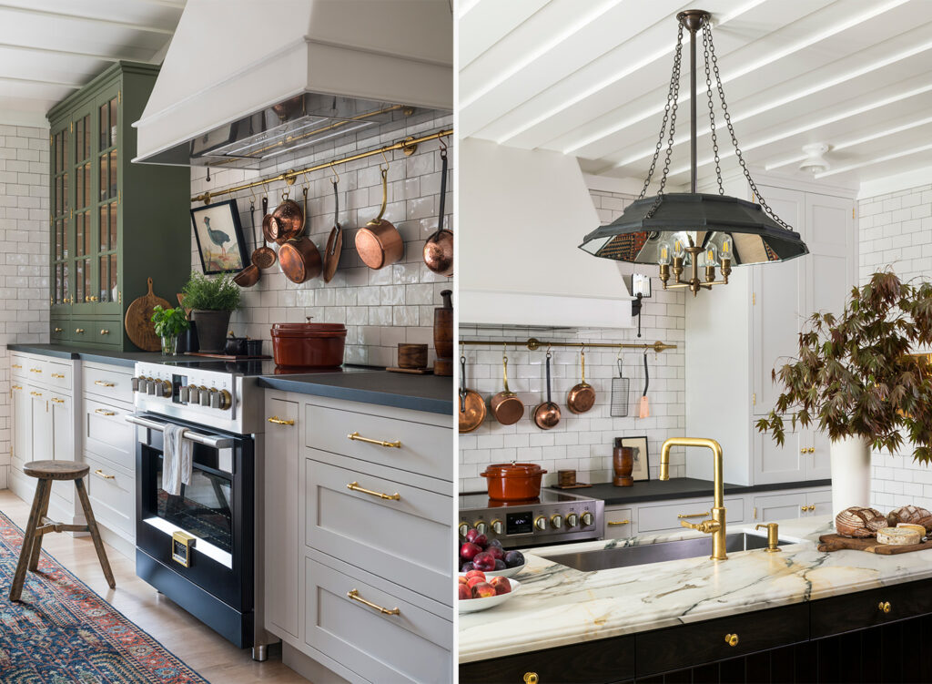
Q: How did you select the tile from Walker Zanger for the backsplash and wall cladding?
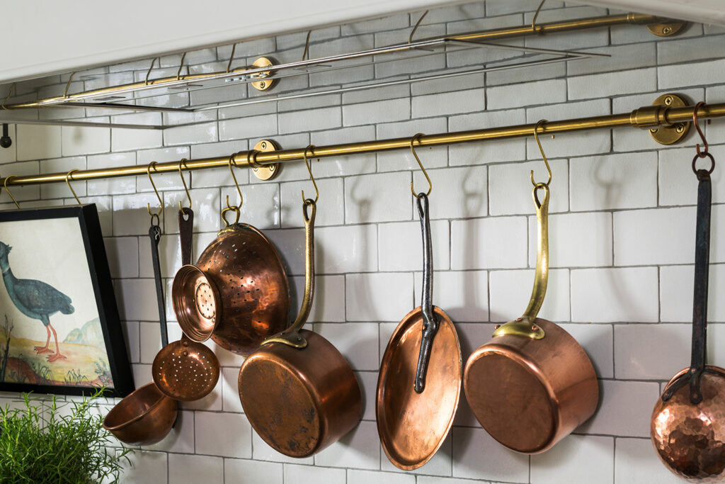
Sarah: Milk Crackle tile was a natural choice because it’s clean and classic, not competing with the bold marble. It reminds me of subway tiles in NYC, which adds a nostalgic touch. I’ve used Walker Zanger’s Café series in several projects, and it never disappoints!
Q: How was your experience selecting stone and tile from a Walker Zanger showroom?
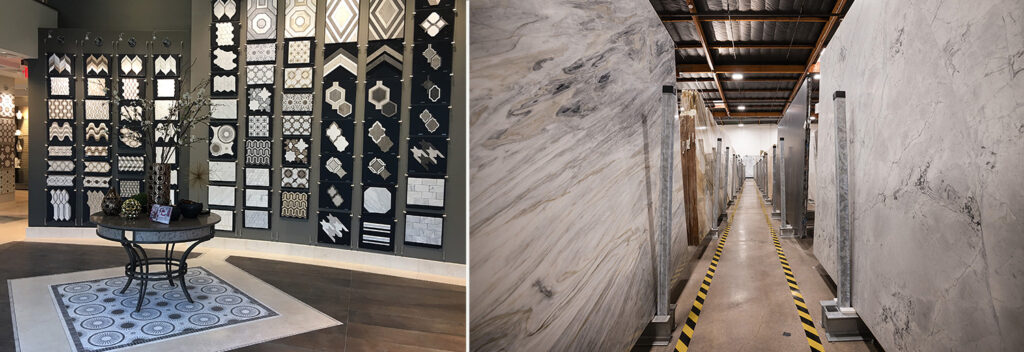
Sarah: Working with Walker Zanger has been excellent for decades, and working with them was as professional and seamless as ever. Their showroom always provides top-notch service and support, making the selection process smooth and enjoyable.
Q: As sustainability becomes a greater focus, how does your design philosophy embrace this shift?
Sarah: Our biggest sustainability concern is creating spaces that won’t feel dated and need to be replaced in a few years. We emphasize quality and durability to ensure longevity. The most eco-conscious renovation is one that lasts.
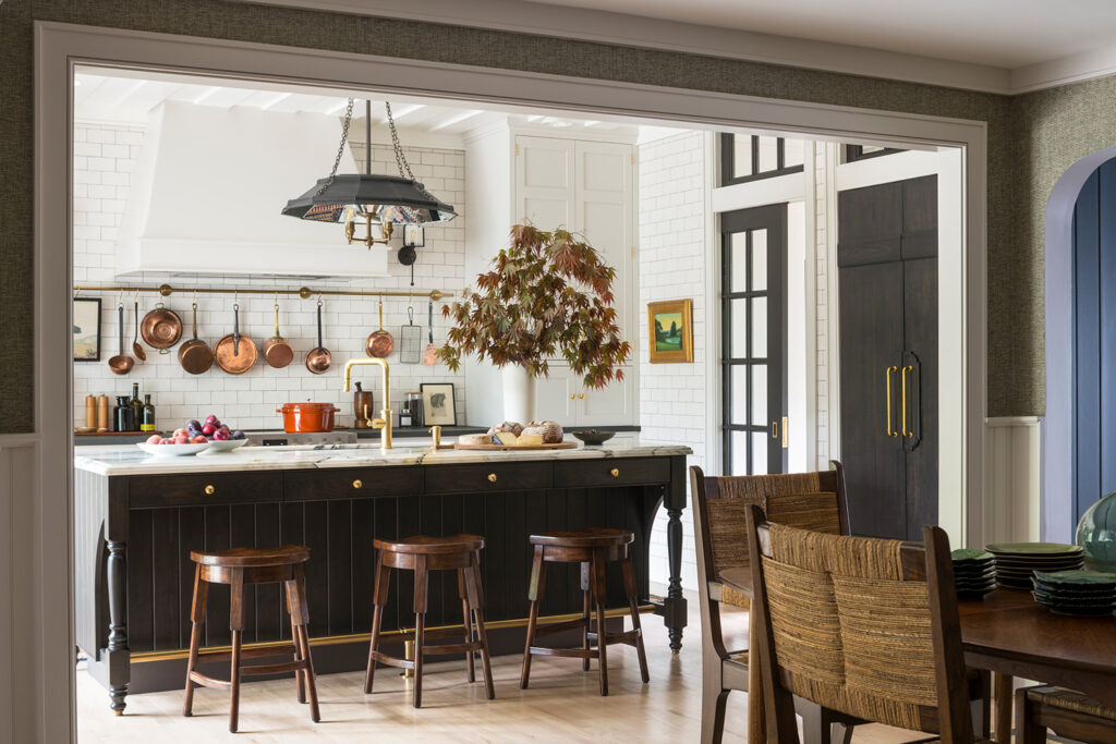
Every design decision in Sarah Robertson’s project comes together to create a space the family can truly enjoy. The bold Paonazzo marble, the classic Milk Crackle backsplash, and each custom detail bring the homeowners’ vision to life. Ready to see how your design choices can create something special? Visit a showroom and start your journey today.


