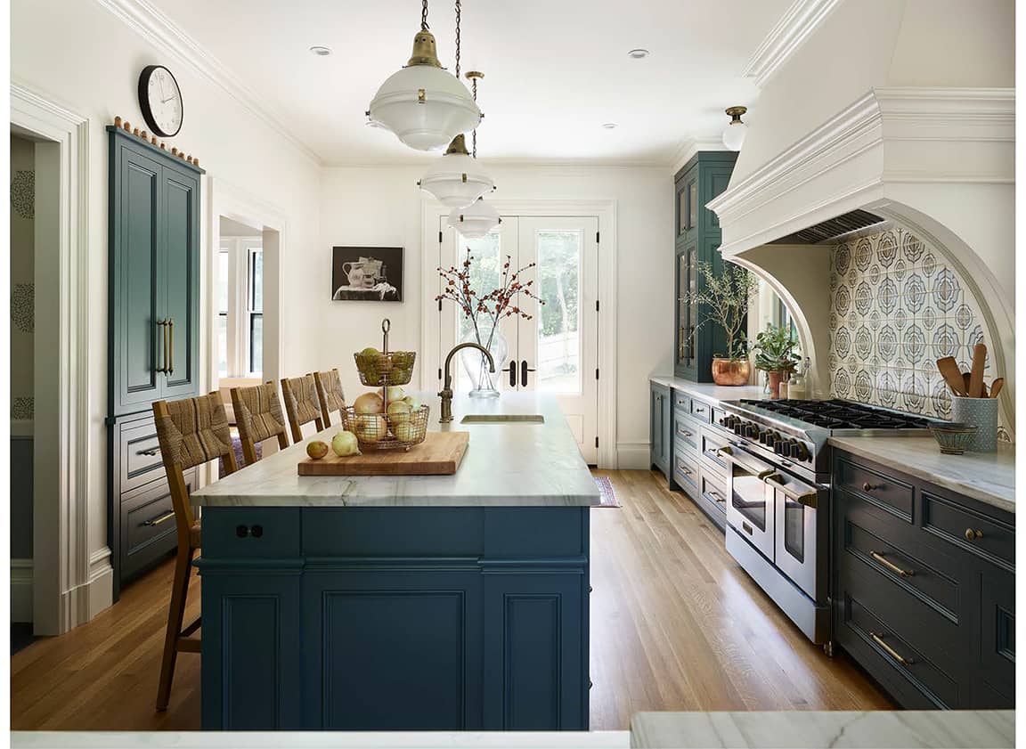
Kitchen and bath designer Karen Swanson of New England Design Works can solve any kitchen renovation design challenge. Whether that means taking away square footage to improve a space’s functionality or looking at new sources across the Atlantic Ocean to meet a client’s specific design vision, it’s all part of the process to provide a client their dream kitchen space.
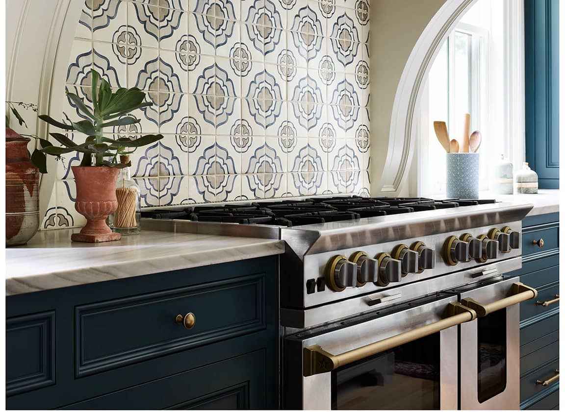
This drive to find design solutions was ever-present in her most recent kitchen project, which was named “Kitchen of the Month” in December 2020 by House Beautiful Magazine. Hired by a couple with British roots to reimagine the kitchen in their National Historic Register property, Swanson was tasked to create a kitchen with an old-world European feel but still meet the functionality needs for today’s modern home.
A successful kitchen and bath designer with many accolades, Swanson is the recipient of Best of Boston “Best Kitchen Designer 2020” in Boston Magazine and has had her work featured in several national shelter publications. She attributes her success to reflecting her client’s style while maintaining ideal functionality.
Read her full interview below that highlights Karen’s attention to detail and design expertise, which shines bright in this modern take on a time-worn feature piece kitchen.
Tell us a little bit about the project and your overall vision for the kitchen.
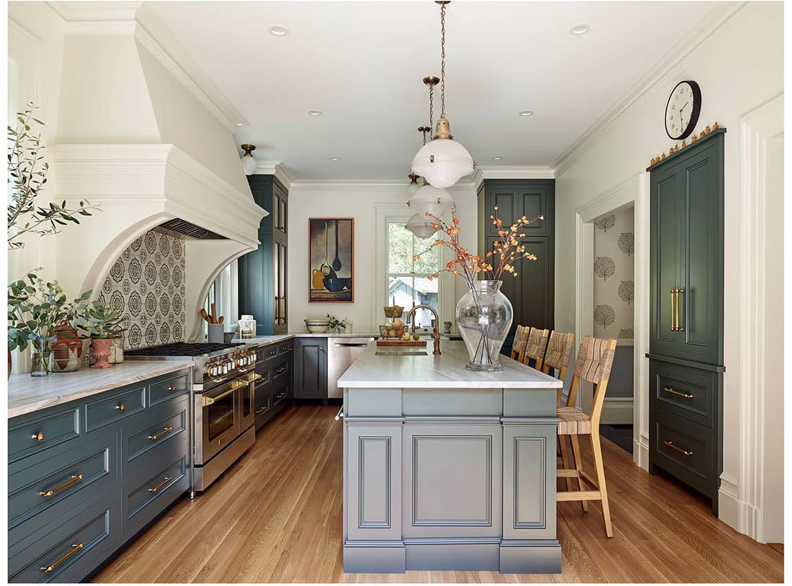
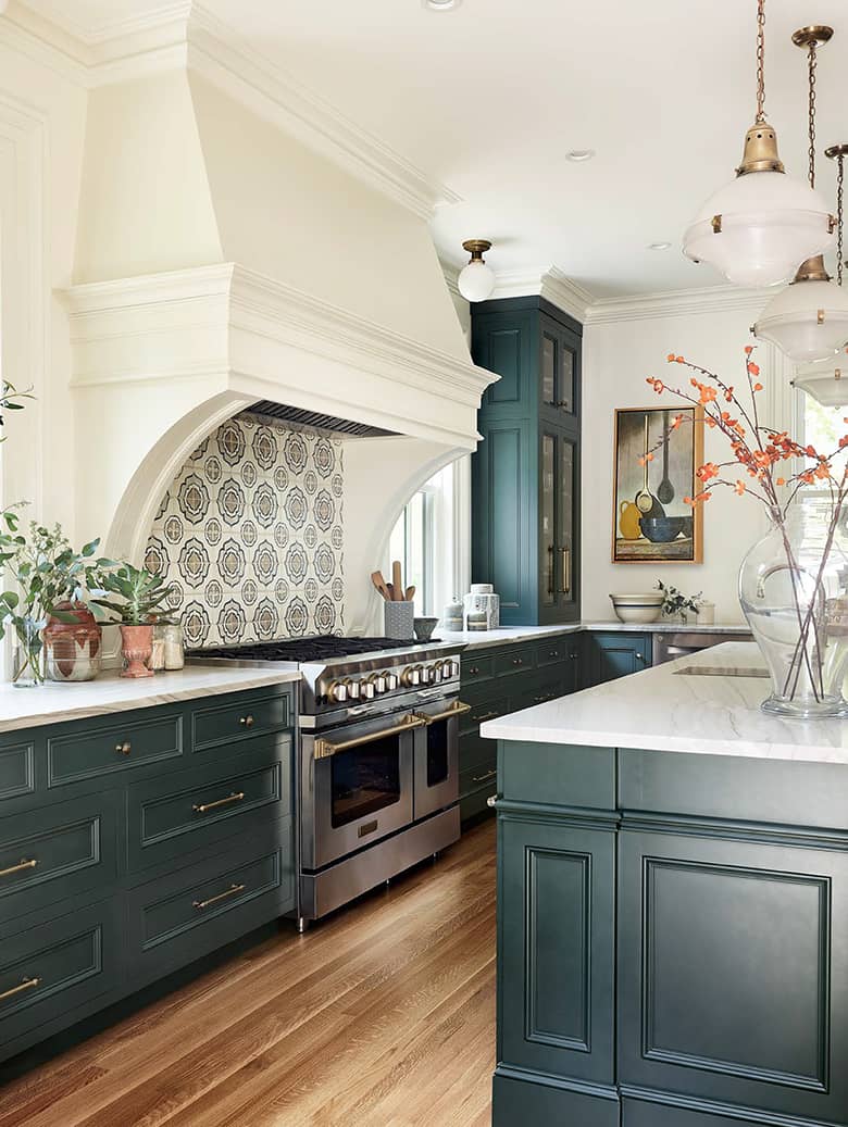
The existing conditions included a small kitchen which was actually carpeted and separated by a half wall from an eat-in kitchen. The kitchen area had a small room off the back which functioned as a pantry of sorts, but which I felt should go. The loss of this square footage allowed so many other options to come to life. I guess it is sort of strange to think about taking away square footage, but what resulted was this gorgeous range flanked by windows and flanked again by large cabinets sitting on the countertop – all of which provides so much presence and impact. One of the homeowners is British, and she desired that British feel. I immersed myself in finding imagery of British kitchens and studied details to attempt to channel what she desired. It was fun learning more about our friends on the other side of the pond, and I love their subtle style and the incorporation of materials that have a time-worn old-world feel.
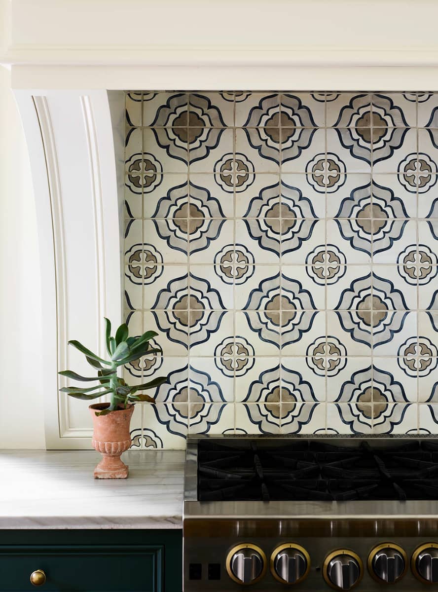
The Duquesa backsplash is a stunning focal point in this kitchen. What made you choose this tile? How do you feel your tile choice impacted the overall design of the space?
Related to my point about the time-worn, old-world feel that I found to be present in so many of the British kitchens I looked at, the choice of the Duquesa tile tied so well into that vibe. You can tell the tile is made from terracotta, a material that is used in other parts of the world. It has a quality to it that you just don’t see with porcelain or ceramic.
Were there any design challenges you had to overcome while creating this space? What were they, and what was the solution?
The biggest design challenge was taking a warren of small rooms and making the result feel like it had always been there. This kitchen is within a home on the National Historic Register, so the moldings and details on both the inside and the outside had to reflect that sense of history. The builder I worked with, Nick Portnoy, is exceptionally adept at working in older homes and has a keen eye for the details. We worked in tandem to achieve this result.
Tell us a little about yourself. What drew you to become a kitchen + bath designer?
Kitchen and bath design is a third career for me, not counting a decade as a stay-at-home mom. I worked in sales after graduating from college and eventually wanted to pursue a more creative path since my hobbies and interests always tended toward the artistic realm. I worked in graphic design for a while and also worked on renovating my home, entertaining friends and family, and spending a ton of time in the kitchen. A light bulb went on: I realized that my love of design and skills as a graphic designer would easily pair with my love of cooking and home renovation toward being a kitchen and bath designer. I attended the Boston Architectural College and upon completion, worked briefly for another firm before starting New England Design Works. I am passionate about what I do and love that it combines all the pieces and parts from everything I did previously, even including the sales job, graphic design, raising kids and entertaining friends, home renovations, etc. It’s nice to see things come full circle and to feel great about the winding road a career path can take.
Are there any design requests from clients that you have noticed emerging as trends over the past year?
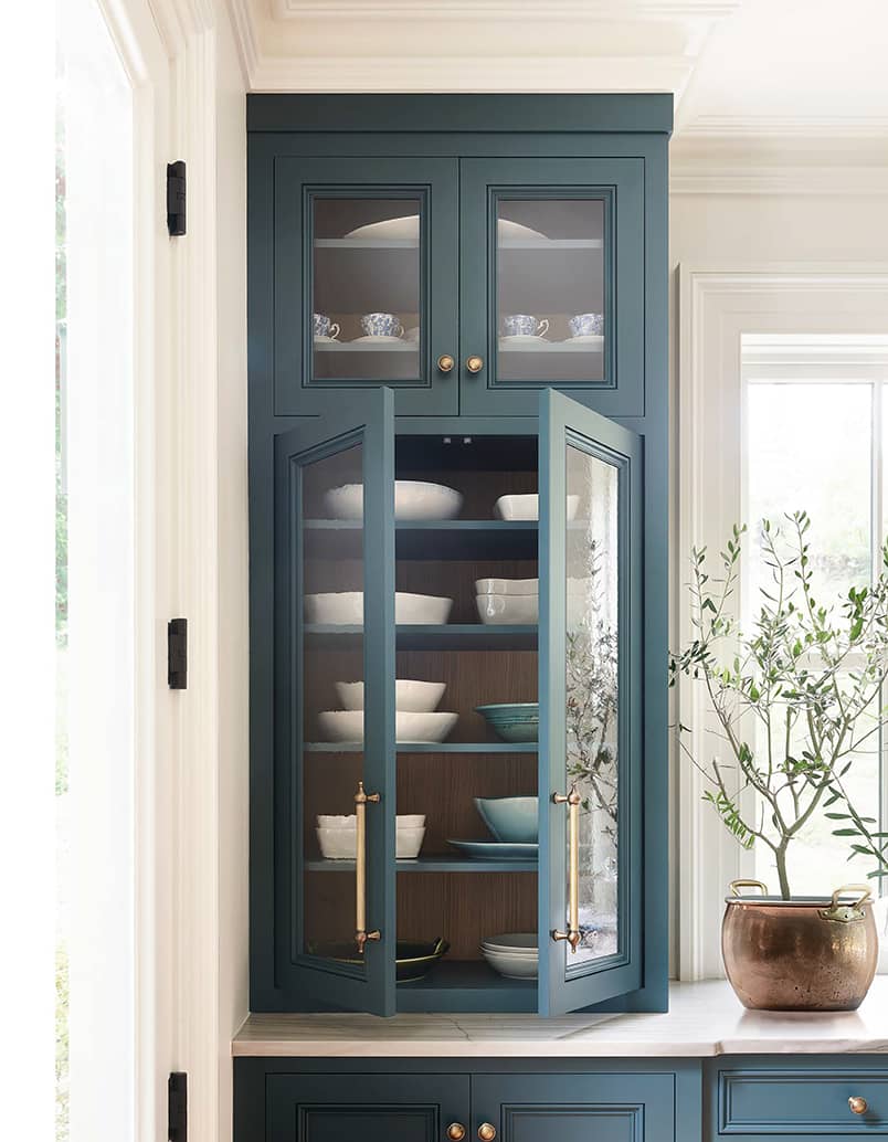
I do see people wanting a lighter touch, fewer uppers with bulky cabinetry, and tucking appliances away where possible. Making the kitchen more about the views outside the windows or the architectural details of the home vs. blanketing its walls with cabinetry.
What are your top three design tips?
First, do not be in a rush during the design phase. Hold off on making decisions until there is a really clear vision for where the space is going. Second, understand that the kitchen is really designed around the appliances. Keeping an open mind about all the new offerings and the solutions they can provide can allow for ideas that otherwise wouldn’t be possible. Three, don’t play it too safe! No guts, no glory!
Which Walker Zanger products have caught your eye for future design projects?
I’m in love with your 70’s inspired Pietta Donovan series and would love to find the right project to use this with. I’ve also always been a fan (since it’s introduction) of the Robert A. M. Stern ceramic tiles. I find them to have a hint of masculinity, but in a very subtle way, and in a way that can feel classic (like subway) but with an interesting little twist. You make beautiful tiles and I love the way you’re always at the leading edge of trends. I’m fortunate to a have a high service beautiful showroom nearby that keeps updated displays of Walker Zanger (Tile by Design in Danvers, MA).
Walker Zanger Products
Kitchen Backsplash


